
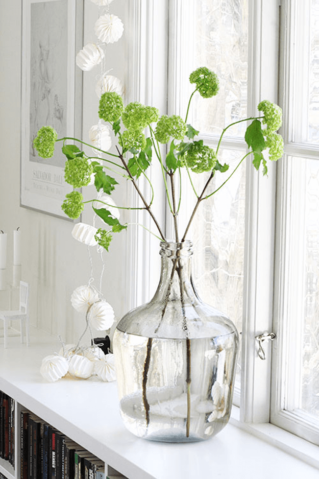
From hues that are bright and vivid to those that convey a sense of earthiness, Pantone’s top 10 colors for 2017 are reminiscent of the colors that surround us in nature. The standout among the—Greenery.

Every year since 2000, the company has chosen a color that reflects the current cultural climate. In the following year, the color has historically influence trends in all facets of design, architecture, interior décor, fashion, food, travel—the list goes on. For 2017 the selection was Greenery, signifying beginnings: a fresh New Year; healthier food resolutions and growing vegetarian trends; grass and the outdoors during spring and summer.
But most prominently, the yellow-green hue (specifically, Pantone 15-0343) comments on the concept of “environment.”
Most obliviously, “environment” today refers to the “go-green” movement-which, while not a revolutionary idea in 2017, has reached a crescendo this year.

via Architectural Digest
Leatrice Eiseman, Executive Director of the Pantone Color Institute, sees the new color of the year as the Nature’s neutral and the incentive to not only bring a little bit of Nature into your home but also spend more time in the outdoors in 2017.
via Setting For Four
Pantone’s 2017 Color Report evokes a spectrum of emotion and feeling. “From the warmth of sunny days with Pantone 13-0755 Primrose Yellow to the invigorating feeling of breathing fresh mountain air with Pantone 18-0107 Kale and desire to escape to pristine waters with Pantone 14-4620 Island Paradise, designers applied color in playful, yet thoughtful and precise combination to fully capture the promises, hope and transformation that we yearn for each Spring,” said Eiseman.
Take a look for yourself at Pantone’s 2017 Color Report, and see how you can pair them in your own home to give an uplifting, natural boost this year!